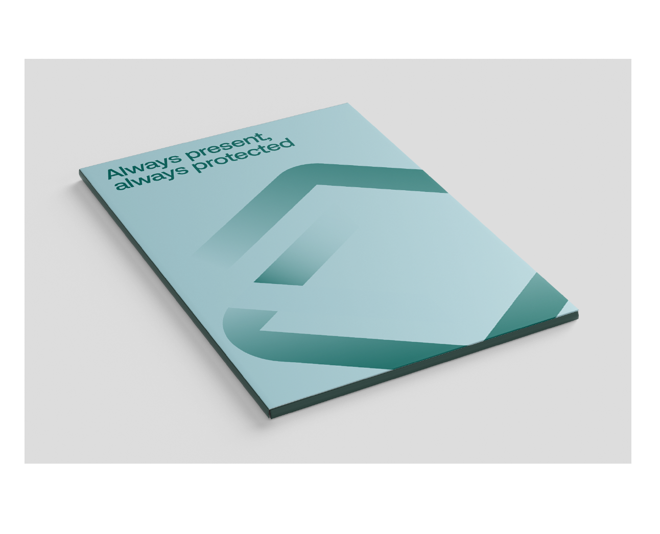
Brand Guidelines
This brand guideline encompasses the basics of working with the CyberAssureTech look, feel, and logo. It is a collection of best practices for us to maintain cohesion and consistency when we step out into the world.
Trust is a major factor when customers and partners decide to work with us, and this guideline provides a framework to make sure that we keep that trust through a consistent visual expression.
Name
CyberAssureTech does what it says. Cyber Assurance Technology is our product.
Do not add spaces in between Cyber, Assure and Tech
Do not concatenate into its acronym: CAT.
Do not undercapitalize the A and the T. Ex: Cyberasssuretech


Click to add hex code to clipboard:
Logo
Our logo is the most important component of our visual identity. It consists of two unique graphic elements: the symbol and the logotype.
Our logo draws inspiration from layers of paper: the double-checked list that is a metaphor for our company.
Full color
These logos should be used in the majority of applications.


One color
For use in areas and places where gradients in printing aren’t possible.




Black and white
For use only in restricted situations where a vendor specifies.





Greyscale
For use only in restricted situations where a vendor specifies.



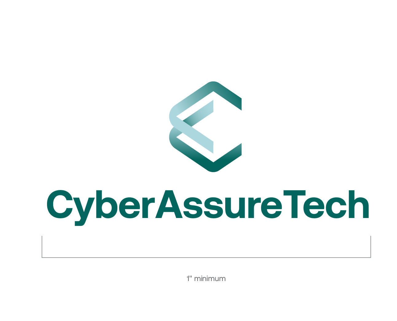
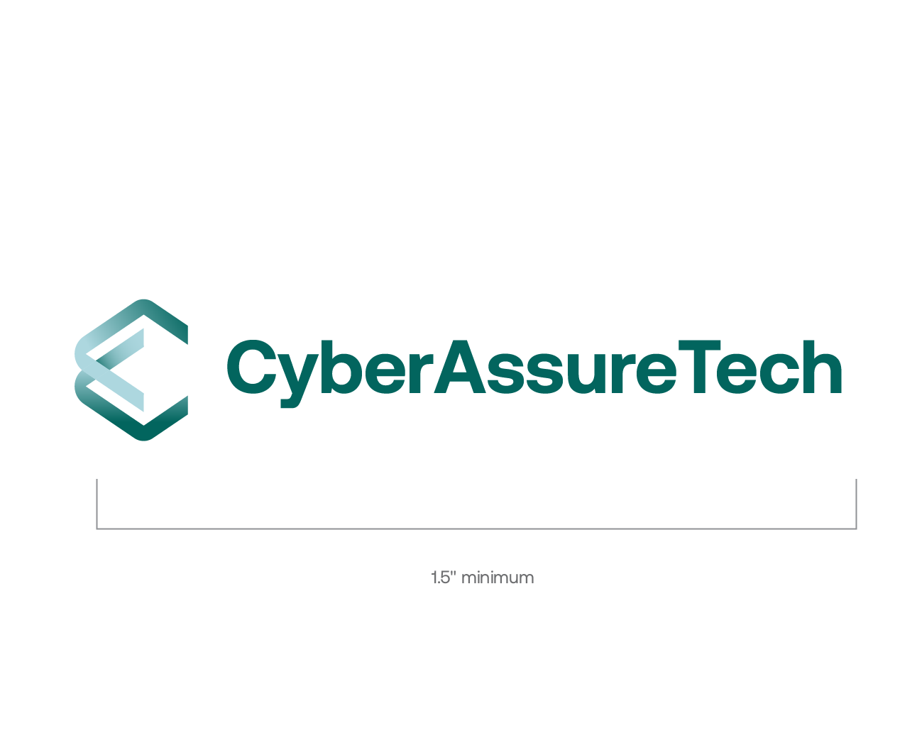
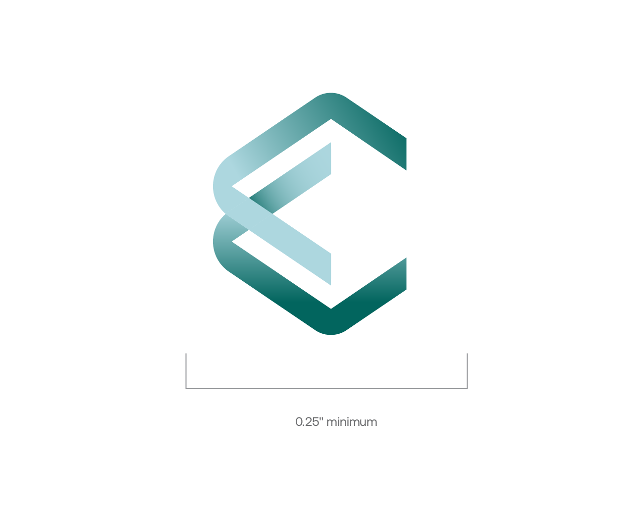
Minimum size
Our logo is the most important component of our visual identity. It consists of two unique graphic elements: the symbol and the logotype.
Our logo draws inspiration from layers of paper: the double-checked list that is a metaphor for our company.
Clear space/Safe zone
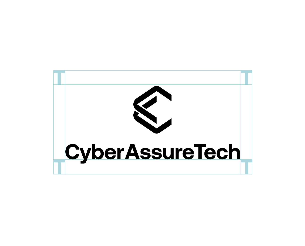
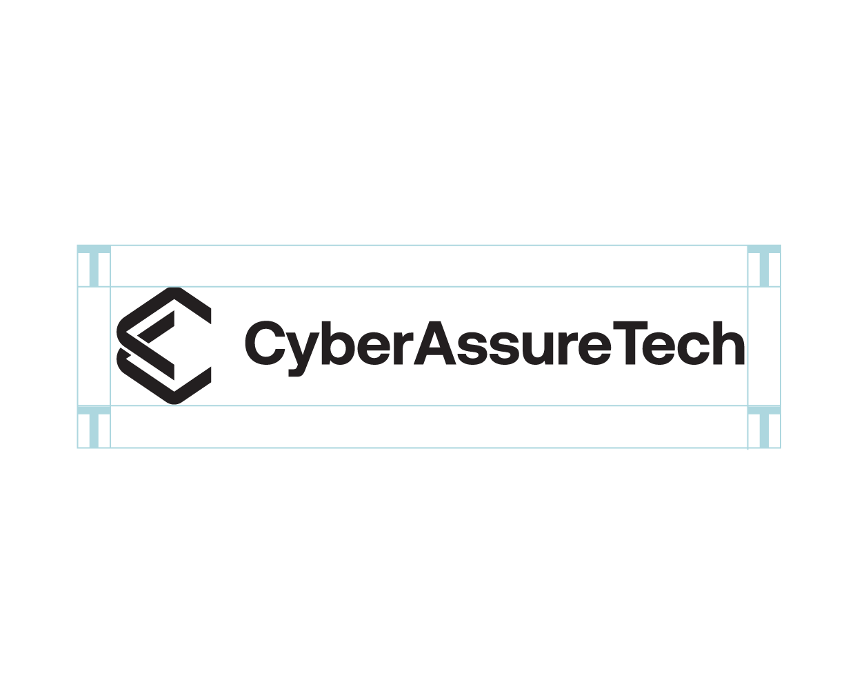
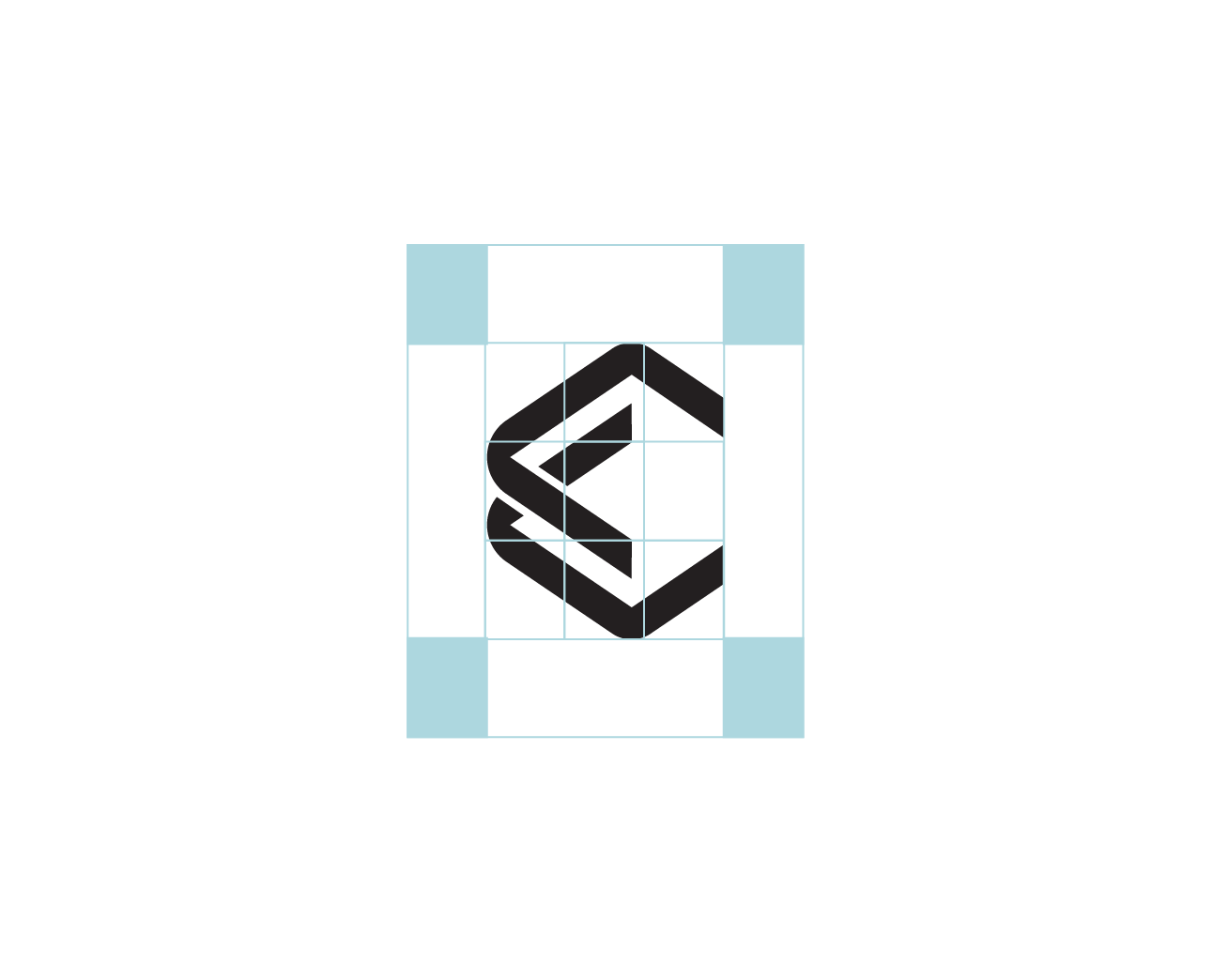
The clear space around our logo allows it to stand out from surrounding elements.
Whenever possible, allow more clear space around our logo than the minimum specified. Proportional sizes and distances were established for ideal visual balance between the logotype and symbol.
In the full logo mark, we base the clearance zone on the capital “T”.
In a symbol-only situation, we base it off one unit of 3×3 grid, applied to the symbol mark.
Don’ts
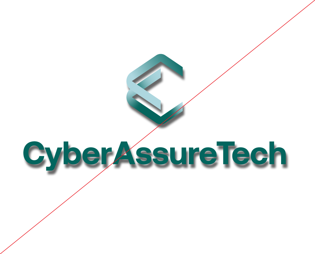
Adding effects to the logo.
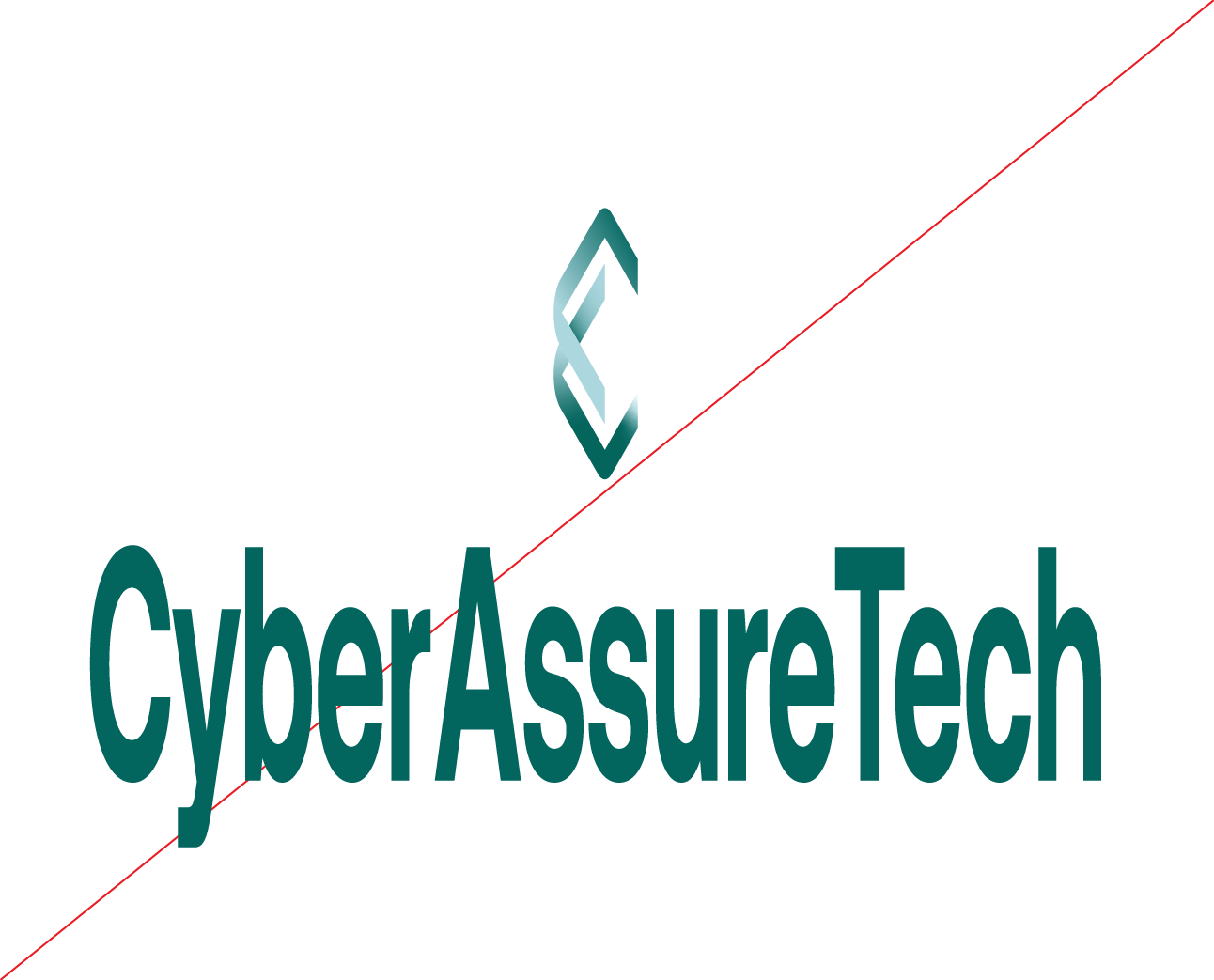
Distorting our logo.
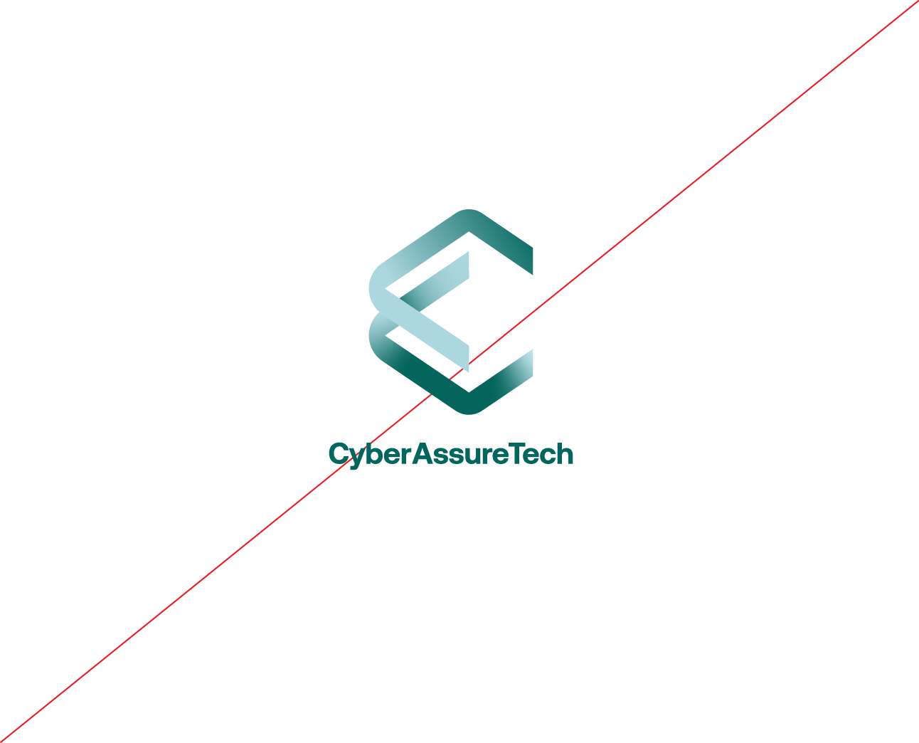
Changing the proportion of elements.
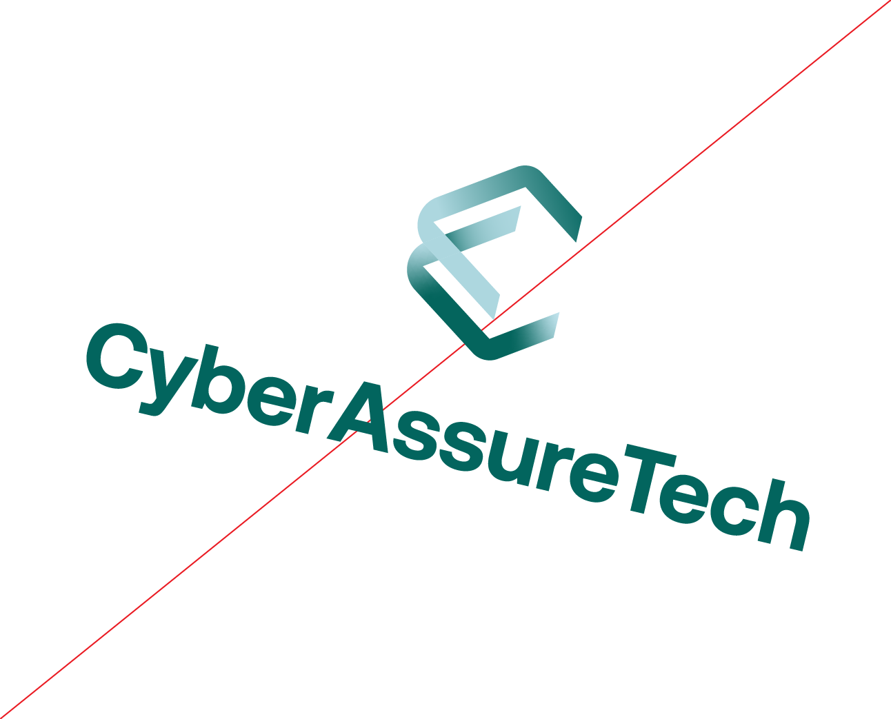
Rotating the logo.
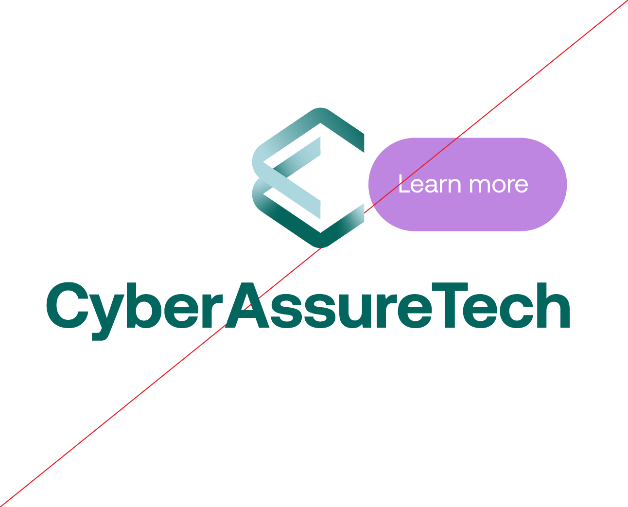
Disrespecting the clear space area.
Changing the colors of the symbol.
Use backgrounds that compete with the logo.
Use logos and backgrounds with insufficient contrast.

Use the logo on busy backgrounds.
Graphic system
Colors
Our colours balance an approachable attitude with technological sophisitication and intelligence.
Core colors
Moss
Hex: B6dcd3
CMYK: 28 2 18 0
Pantone: 566c
Creme
Hex: F5f4ef
CMYK: 3 2 2 4
Pantone: 9043c
Midnight
Hex: 00303c
CMYK: 99 66 55 55
Pantone: 547c
Robin’s Egg
Hex: Acd6df
CMYK: 31 4 10 0
Pantone: 628C
Forest
Hex: 02645e
CMYK: 90 40 61 24
Pantone: 561C
Extended colors
Lavender
Hex: B981d1
CMYK: 30 55 0 0
Pantone: 528C
Watermelon
Hex: F95d5d
CMYK: 0 80 58 0
Pantone: 178C
Color in proportion
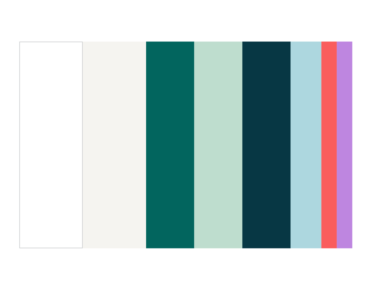
In our system, we have key colours that should show up more frequently than others.
Our lavender and red colours are used as accents or in charts and graphs, and should never take center stage.
Typography
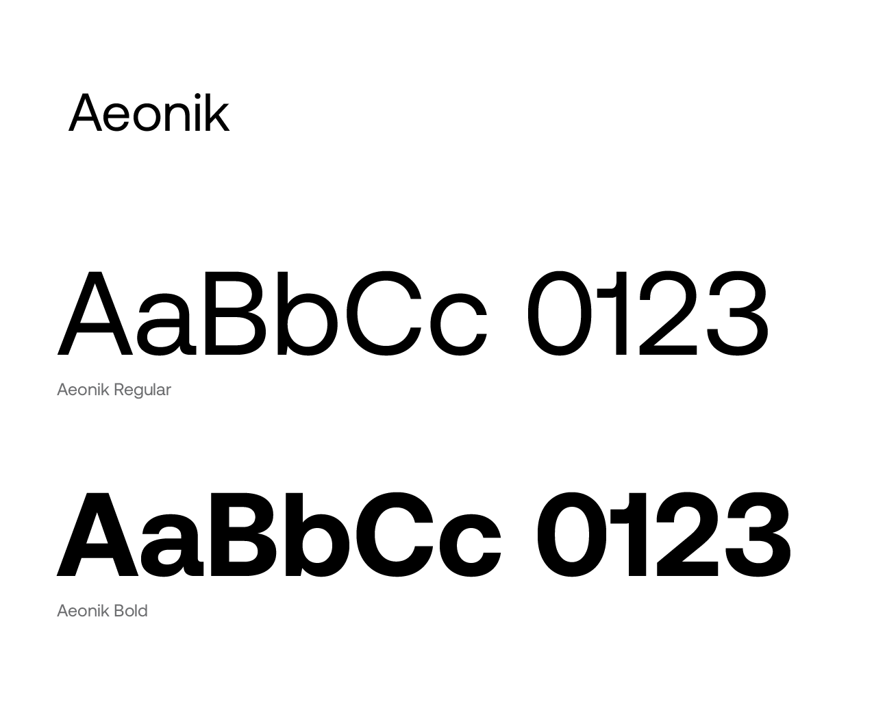
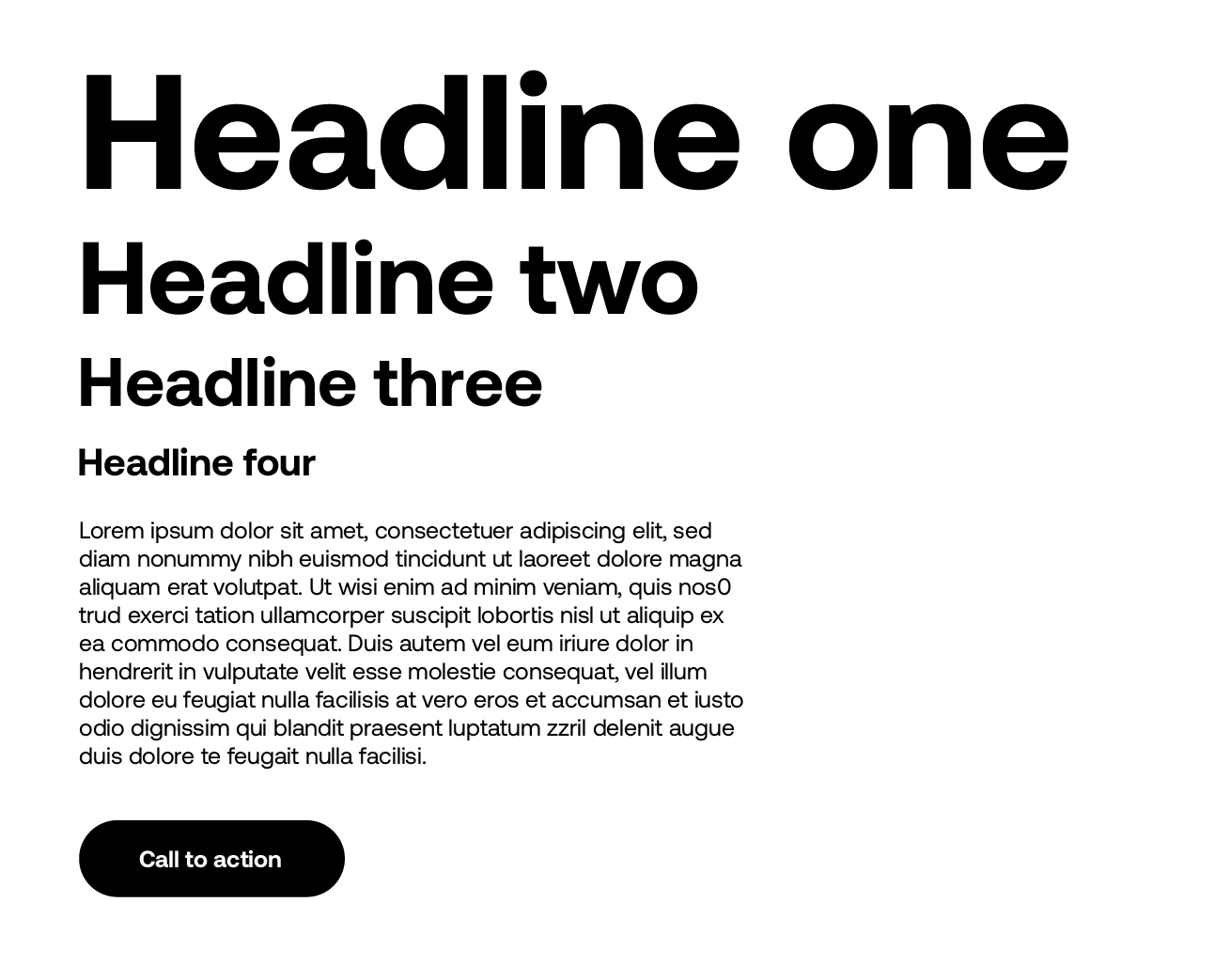
Aeonik is our primary typeface. Its consistent use reinforces our brand identity and guarantees legibility across all channels.
Helvetica Neue is our secondary typeface. It is used whenever Aeonik is unavailable.
Arial is our tertiary typeface. It is used whenever either of our primary or secondary typefaces are unavailable.
Icons
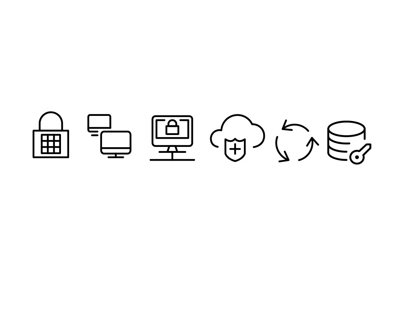
Icons can support text and content.
The streamline icon set pairs well with our typeface and overall brand look, in addition to having plenty of icons that capture key concepts for us.
Graphic element: Logo crop
Our logo is bold, dynamic and confident. In our brand system, we use it in crops to engage the eye, and give a feeling of movement.
When used with our Robin’s Egg and Forest colors in the background, the logo tells a story of moving in and out of the background, like an always-present element that is only there when you need it.
When you crop the symbol mark, it’s fine to rotate the logo or flip it.

Photography
Photography should focus on entrepreneurs and your own team.
They should be neutrally lit, relaxed and approachable shots.

Example applications
